Matt's Blog
Electronic design blog
Friday, June 16, 2017
Friday, June 2, 2017
Wednesday, May 31, 2017
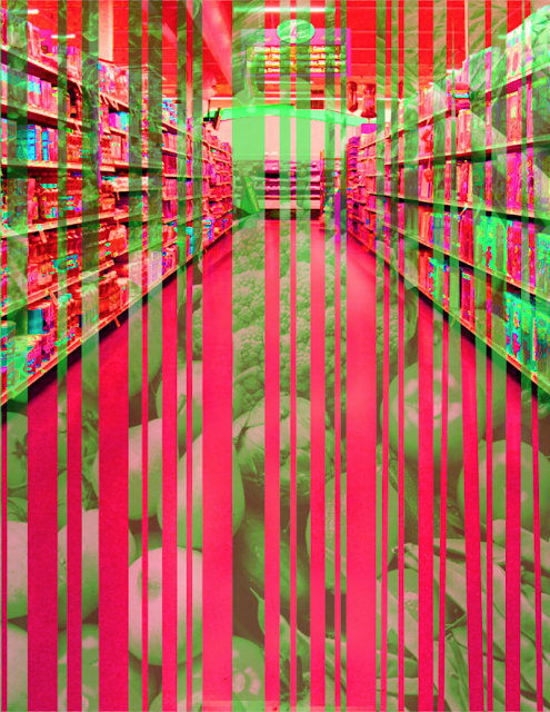
Juxtapose Project


In my Juxtapose Project, I used an image of a grocery isle with unhealthy food. The mask was an image with healthy food cut into a barcode-like shape. The healthy food is in a green color and the grocery isle is red to display that it is bad. The barcode represents that the healthy food was bought over the unhealthy food, just like the mask is over the grocery isle.
Wednesday, May 24, 2017
Helpful Photoshop Tool
The Photoshop tool that was most helpful for me in the Frankenstein Project was the Hue and Saturation adjustment layer. This tool allowed me to edit my masks and images and make them blend with the original image. It allowed me to make objects appear further away and even have shadows similar to the background image. The colors and shades in my image make it appear somewhat believable and without the Hue and Saturation adjustment layer this would not have been possible.
Subscribe to:
Comments (Atom)


